This is me talking through the creation of my double page spread
Tuesday, 20 December 2011

Final Production Production Process: Contents Page
This is me talking through the creation of my magazine contents page
Final Production Production Process: Front cover
This is me talking through the creation of my magazine front cover
(due to the length of the video it has had to be split into 2 halves and made into one playlist so the 2nd part should automatically start after the 1st one)
Saturday, 17 December 2011
Final Magazine Pieces
I have decided to re do my AS media practical production as I was dissatisfied with the grade I first got and believe myself to be capable of more. Below is my second piece of coursework my music magazine. I have kept some things the same and changed others. The style of the magazine has changed quite a bit however the double page spread has stayed very similar. All of the reasons why will be explained in my final evaluation. Make sure to click on the images to view them larger!


Tuesday, 13 December 2011
Photo Shoot And Analysis
These are some of the images from my second photo shoot. I used a Canon digital camera, the same one that I use in my first photo shoot, to take pictures. Although some of these images look dark it didn’t matter as these can all be brightened and have the contrast adjusted in postproduction. My first mistake I made was to walk into the school canteen and pick a random student as my model, the problem with the person I used was that they had never done any modelling work before, couldn't be serious about what we were doing, and wasn't wearing the right clothing. I then decided to get different model and chose one of my friends from my media class, as I knew they would understand the seriousness of the occasion and do as I asked, and not mess around. However after getting him to jump twice, he hurt his ankle so then I had to move on to third model. My first loads of shots were designed to make the artist look fun, active and energetic. However after reviewing them they did not work as I'd hoped and would not fit in to my magazine, as one of the problems was that the background was too cluttered and this was distracting attention from the main character. I then decided to do some still shots with the character looking more thoughtful and serious, these photos came out a lot better and I found a few that would work for my magazine. I had not planned well for this, as at the same time as trying to rewrite my AS media work I've been trying to do my A2 was well this meant I had to split my time between both. The photos were taken at Richmond School around the site. This worked, as I was trying to present my artist as a fun character in an urban environment also in touch with nature. The site allows me to do this as it is surrounded by green fields and trees this contrasts with the concrete paving, and the hard edges and linear structure of the nearby buildings. Overall my photos shoot was productive although it took a long time to get it right I was pleased with the results and felt that I had some good, interesting and evocative shots. If I were to do my photo shoot again I would plan more carefully and make sure I had a proper model first time, so as not to waste time trying to find one. If I did do the photo shoot again I would still keep the location the same as I think it worked well.


Tuesday, 12 April 2011
personal evaluation
For my evaluation I have chosen to do so through a series of questions and answers.
In what way does your magazine use, develop and challenge forms and conventions of real media products?
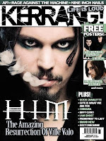 One of the things I believe I did differently to any other professional magazine was the front cover more specifically the image on the front cover. I chose to use a long shot really with the subject in full view but not very close up. Now if you compare this to say an issue of Kerrang like the one on the right, the image on the front cover is up close and personal this allows you,as the reader, to really feel their emotions. This is not to say that you cant feel the emotions of the subject in my photograph, quite the contrary, it really reflects what I wanted Arron to be all about, cool, calm, collected and yet fun and different enough to be caught lying on top of a wall with his arms folded above his head.
My title 'MaSH uP!' was chosen to show that everything in this magazine was all mashed up together in one form of media and I don't know of another magazine that is called this therefore it stands out. My images were all taken to allow the view to see the character of the subject and the actual surroundings which I think they all managed beautifully. I didn't have many costumes and props, my photos were mainly focused on the subject and the backgrounds. My title font was very interesting. I created it in a very interesting way and it looked very different to anything I have ever seen which means that it would stand out on the shelves for potential buyers. My written content in the magazine wasn't ground breaking but it was all written and made up by me with no input from anyone else which I think makes my project stand out among other peoples coursework.
I have also purposefully not included a barcode on the front cover. This is because I had so much content on the cover that I couldn't fit anything else on there. I also thought that it might affect the look of my magazine. You may have also noticed that some things such as country names and beginnings of sentences had no capital letters on the contents page for example. I did this as I thoguht this may bring me closer to my audience how are of a younger generation and this is the magazine nearly rebelling against grammar and society in a way as we are not conforming to certain things, this is what my magazine is all about.
How does the magazine represent particular social groups?
My product is aimed at 14-30 year olds who like punk/rock music this genre is normally associated with hardcore sort of rebels of society who don't conform with 'normal' people in society. However I think that my magazine actually represents people in the industry quite positively, particularly young people who are getting a lot of bad press at the moment. This was one of the main reasons why I chose to do an article about a young musician and show that we are not all lazy layabouts who sit at home playing games and being antisocial, there are in fact some quite talented and genuine young people out there so I think that it represents young people rather well. I managed to make Arron look fun and exiting when I got him to do the heel click in the archway and yet I kept it punk rock with the colour scheme which I used throughout the magazine.
Which kind on media institution might distribute your media product and why?
I did some quick research on the Internet and found a company called Bauer Media Group (BMG) who are a print publishing giant based in Germany and whose worldwide circulation of magazines amounts to 38 million magazines a week which is vast. I think that this would be a suitable publishing company as some of the magazines which it publishes are every successful such as the music magazine Kerrang, which has really been my business model and some of my inspiration has come from this magazine.
Who would be the audience for you magazine? How did you address/attract your audience?
My product is aimed at 14-30 year olds who like punk/rock music however it is not as hardcore as some magazines related to this genre which is one of the reasons why I think my magazine is unique and why I think there is a niche for it in the market. A lot of the magazines produced to represent the genre of music I have chosen for my magazine are quite dedicated to the genre. Whereas I think that my magazine is not as intense which I think is great as it allows people who like the type of music but are not completely in love with it and more mainstream readers to read about it without feeling overwhelmed however there is enough of the right material there for it to attract the more dedicated reader as well.
What have you learnt about technologies from the process of constructing this product?
The newest bit of technology I have learnt to use in this process has been Blogger. I have never used the site before let alone blogged about anything either so this was a whole new experience for me. I enjoyed using the internet blogging service, it was easy to use but is lacking in one thing a good spell checker. It does have one but it is not very good and misses out lower case I's which is rather frustrating. I also learnt to use Prezi which is a free online presentation program which allows you to create presentations and fly through them with the camera, I also had to learn how to embed them so you could view it straight form the blog without having to go to a link and on to another website. I found that this was a fun and interesting way of presenting evaluations and other presentations.
The other main programme that I have used throughout the whole production of my magazine is Adobe Photoshop CS5 this truly is a marvel of modern technological invention, I know I sound like an old person baffling on but it is true, this programme is a wonderfulyou've learnt the ropes its simple and can work wonders. I've learnt that to truly utilize a program you've got to push it to its potential, I've been using photoshop for a number of years now however I really started using its every option when I began this piece of coursework, anyone can just put a couple of filters on a photograph but it takes real skill to make anything look professional and I think ive pretty much cracked it, I thoroughly enjoyed using this program.
In terms of technological hardware, I used an SLR Canon Digital EOS 500 to take the photos for my magazine, this is again a delightful piece of kit to work with. I used a wide angle lens in order to achieve the desired effect. It's high resolution images and its ease to use format made it the ideal camera for the job in hand. For editing the photos, I used my own Macbook pro also an amazing piece of equipment its fast and reliable and was the best computer for the task I needed to do.


In what way does your magazine use, develop and challenge forms and conventions of real media products?
 One of the things I believe I did differently to any other professional magazine was the front cover more specifically the image on the front cover. I chose to use a long shot really with the subject in full view but not very close up. Now if you compare this to say an issue of Kerrang like the one on the right, the image on the front cover is up close and personal this allows you,as the reader, to really feel their emotions. This is not to say that you cant feel the emotions of the subject in my photograph, quite the contrary, it really reflects what I wanted Arron to be all about, cool, calm, collected and yet fun and different enough to be caught lying on top of a wall with his arms folded above his head.
My title 'MaSH uP!' was chosen to show that everything in this magazine was all mashed up together in one form of media and I don't know of another magazine that is called this therefore it stands out. My images were all taken to allow the view to see the character of the subject and the actual surroundings which I think they all managed beautifully. I didn't have many costumes and props, my photos were mainly focused on the subject and the backgrounds. My title font was very interesting. I created it in a very interesting way and it looked very different to anything I have ever seen which means that it would stand out on the shelves for potential buyers. My written content in the magazine wasn't ground breaking but it was all written and made up by me with no input from anyone else which I think makes my project stand out among other peoples coursework.
I have also purposefully not included a barcode on the front cover. This is because I had so much content on the cover that I couldn't fit anything else on there. I also thought that it might affect the look of my magazine. You may have also noticed that some things such as country names and beginnings of sentences had no capital letters on the contents page for example. I did this as I thoguht this may bring me closer to my audience how are of a younger generation and this is the magazine nearly rebelling against grammar and society in a way as we are not conforming to certain things, this is what my magazine is all about.
How does the magazine represent particular social groups?
My product is aimed at 14-30 year olds who like punk/rock music this genre is normally associated with hardcore sort of rebels of society who don't conform with 'normal' people in society. However I think that my magazine actually represents people in the industry quite positively, particularly young people who are getting a lot of bad press at the moment. This was one of the main reasons why I chose to do an article about a young musician and show that we are not all lazy layabouts who sit at home playing games and being antisocial, there are in fact some quite talented and genuine young people out there so I think that it represents young people rather well. I managed to make Arron look fun and exiting when I got him to do the heel click in the archway and yet I kept it punk rock with the colour scheme which I used throughout the magazine.
Which kind on media institution might distribute your media product and why?
I did some quick research on the Internet and found a company called Bauer Media Group (BMG) who are a print publishing giant based in Germany and whose worldwide circulation of magazines amounts to 38 million magazines a week which is vast. I think that this would be a suitable publishing company as some of the magazines which it publishes are every successful such as the music magazine Kerrang, which has really been my business model and some of my inspiration has come from this magazine.
Who would be the audience for you magazine? How did you address/attract your audience?
My product is aimed at 14-30 year olds who like punk/rock music however it is not as hardcore as some magazines related to this genre which is one of the reasons why I think my magazine is unique and why I think there is a niche for it in the market. A lot of the magazines produced to represent the genre of music I have chosen for my magazine are quite dedicated to the genre. Whereas I think that my magazine is not as intense which I think is great as it allows people who like the type of music but are not completely in love with it and more mainstream readers to read about it without feeling overwhelmed however there is enough of the right material there for it to attract the more dedicated reader as well.
What have you learnt about technologies from the process of constructing this product?
The newest bit of technology I have learnt to use in this process has been Blogger. I have never used the site before let alone blogged about anything either so this was a whole new experience for me. I enjoyed using the internet blogging service, it was easy to use but is lacking in one thing a good spell checker. It does have one but it is not very good and misses out lower case I's which is rather frustrating. I also learnt to use Prezi which is a free online presentation program which allows you to create presentations and fly through them with the camera, I also had to learn how to embed them so you could view it straight form the blog without having to go to a link and on to another website. I found that this was a fun and interesting way of presenting evaluations and other presentations.
The other main programme that I have used throughout the whole production of my magazine is Adobe Photoshop CS5 this truly is a marvel of modern technological invention, I know I sound like an old person baffling on but it is true, this programme is a wonderfulyou've learnt the ropes its simple and can work wonders. I've learnt that to truly utilize a program you've got to push it to its potential, I've been using photoshop for a number of years now however I really started using its every option when I began this piece of coursework, anyone can just put a couple of filters on a photograph but it takes real skill to make anything look professional and I think ive pretty much cracked it, I thoroughly enjoyed using this program.
In terms of technological hardware, I used an SLR Canon Digital EOS 500 to take the photos for my magazine, this is again a delightful piece of kit to work with. I used a wide angle lens in order to achieve the desired effect. It's high resolution images and its ease to use format made it the ideal camera for the job in hand. For editing the photos, I used my own Macbook pro also an amazing piece of equipment its fast and reliable and was the best computer for the task I needed to do.

this is the camera i used

and the laptop.
Looking back at your preliminary task, what do you feel you have learnt in the progression from it to the full product?
I feel that throughout the process my skills have only become stronger and stronger particularly with Photoshop where I have come on in leaps and bounds. I have learnt to use the shadow option for layers and how to get the right mix of all the options for the shadow to create something more realistic. I have also been using the text tool a lot more than I have ever used it before and have leant how to warp text shrink and enlarge it as well as as make it in perspective with images. I aso learnt how to use the clone stamp tool and used it to quite good effect when I was editing the image for my front cover.
When I was doing my photoshoot I took over 100 photos as this allowed me lots of choice when I was creating my final magazine. Compared to my preliminary task when I only took about 20 photographs. I realised that by taking lots of photos if some didn't work then I had others to fall back on and it also gave me more ideas for things I could do in my magazine.
I have learnt how to plan a photoshoot organising transport costume and subjects and that scouting out a location before hand and doing some sketches of what shots you would like to take before is a great way of making sure that you do not run out of ideas.
I have also come quite far in understanding what works in a particular genre of a magazine and what doesn't. I have also learnt that unless its a thorough evaluation it isn't worth doing. Doing this project has given me an insight into the amount of effort that must go into creating a magazine and why a lot of them are only monthly issues it must take vast amounts of time to create a magazine.
Monday, 11 April 2011
Target Audience Analysis
These are four links to responses from 4 people from my target audience. I did embed them however the video size was too big.
analysis 1
analysis 2
analysis 3
analysis 4
I used a free program called jing which allows you to video your screen and commentate at the same time and then uploads it to a website called screencast this is the website that the link will take you too.
(allow the website a bit of time to load the video and give your mouse a bit of a wiggle and the video wil appear. make sure your volume is turned on.)
analysis 1
analysis 2
analysis 3
analysis 4
I used a free program called jing which allows you to video your screen and commentate at the same time and then uploads it to a website called screencast this is the website that the link will take you too.
(allow the website a bit of time to load the video and give your mouse a bit of a wiggle and the video wil appear. make sure your volume is turned on.)
Subscribe to:
Posts (Atom)